Developing the brand
Kind had a simple brand in place, however the only element that needed to stay was the logo, and with teal as the primary brand colour a much broader colour palette was developed to help support the overall tone of the brand, leaning into the various sectors Kind work within: Environment, Sustainability and Arts and Culture.
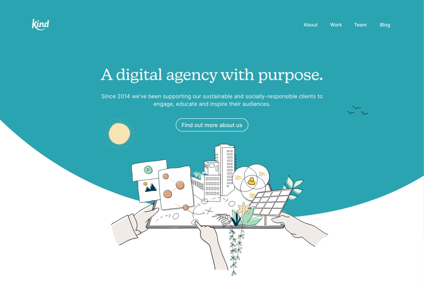
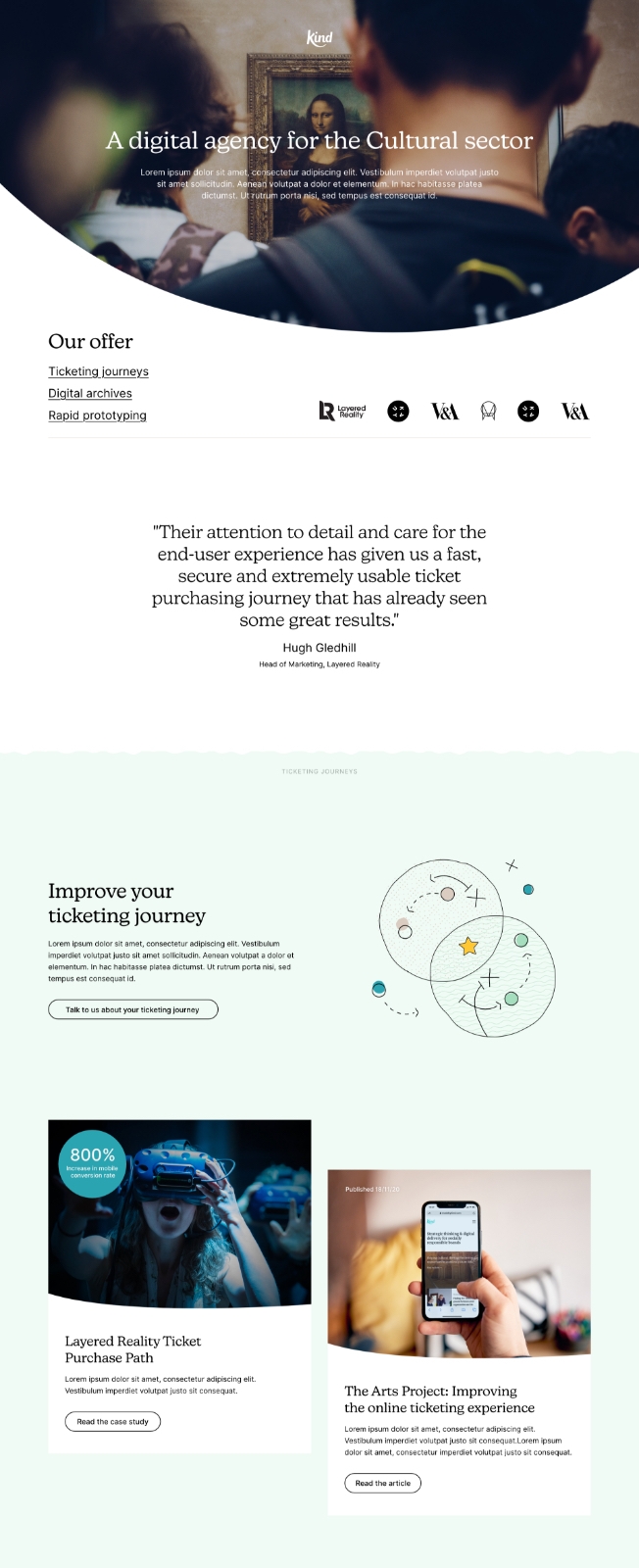
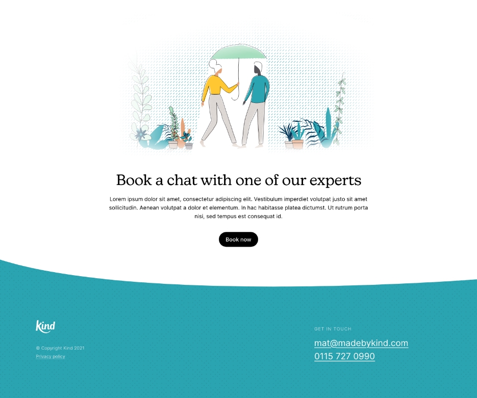
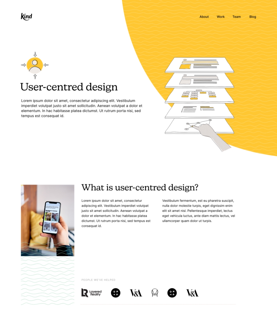
Illustration
An illustrative style was developed in order to extend the visual language of the brand and communicate the various interests and values the company embody.

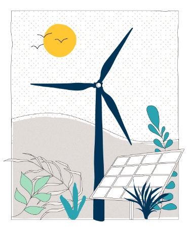
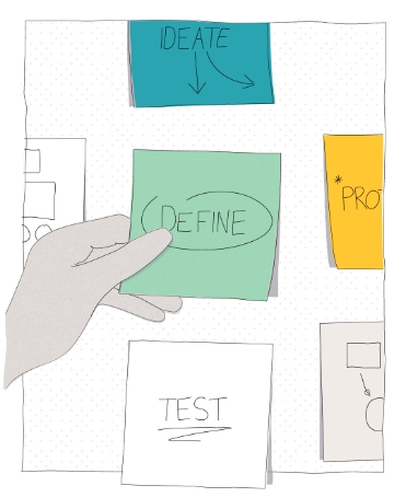
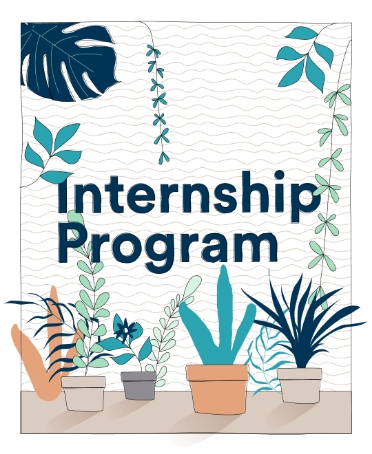

Illustration could be used as a communication tool when it came to updates and announcements, for example, creating illustrations for news relating to projects with V&A (Glastonbury) and the BBC.


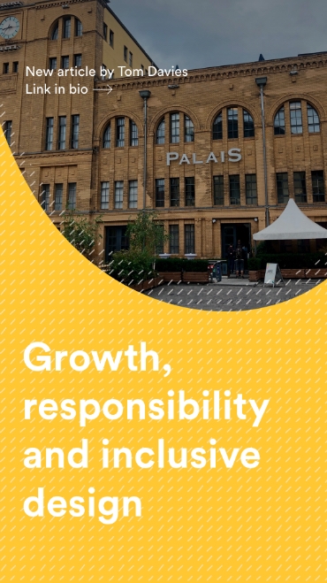
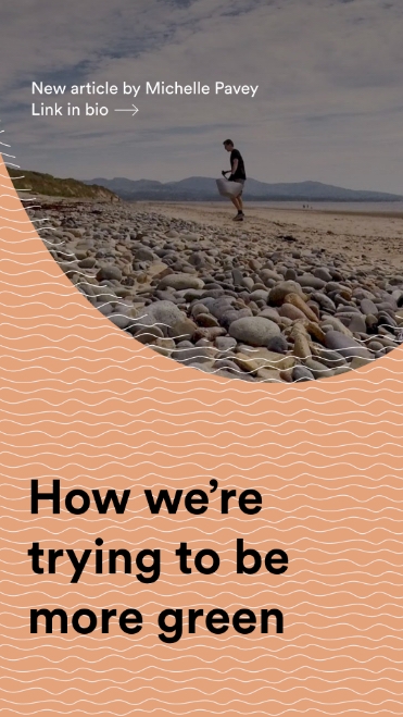
Social
Along with an adaptable colour palette, organic patterns were created to bring a sense of depth and dynamism. Here they're applied across a series of soical templates for Instagram stories.
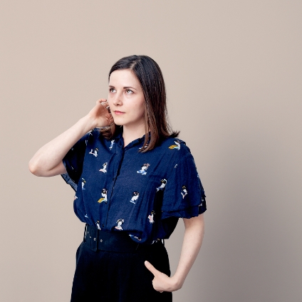
Photography
As well as branded team shots, photography was art-directed with the aim of capturing the personality of a friendly, approachable team of experts. With a relaxed office culture, photography needed to be natural and authentic with an underlying sense of fun.
Photography by Chris Underwood.